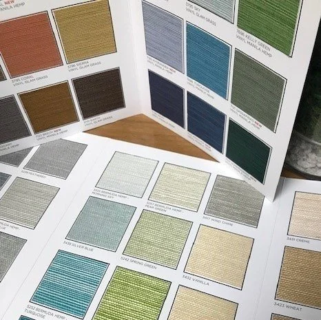
Choosing the right color is rarely as simple as selecting a shade from a screen. In industries such as interiors, textiles, furniture, coatings, and manufacturing, small differences in color can significantly affect how a finished product looks. Lighting, surrounding materials, surface texture, and viewing conditions can all influence color perception.
This is why physical color reference tools continue to play an important role even as design workflows become increasingly digital. Color fan decks and swatches give professionals a practical way to examine, compare, organize, and communicate color choices throughout a project.
Why Color Looks Different in Different Settings
A shade seen on a laptop may not appear the same on a phone, printed image, or showroom wall. While ambient illumination can alter how actual colors are perceived, screen brightness and display settings also influence digital color.
Appearance can also be influenced by the substance itself. When a color is applied on a glossy surface, it may appear different from when it is applied to a matte surface. The visual outcome can also be influenced by fabric construction, texture, and grain.
A reliable point of comparison is offered by tangible references. Designers and purchasers can inspect real samples in the lighting conditions appropriate for their project, instead of depending just on a digital representation.
Making Color Comparisons More Practical
Comparing several possibilities at once is one of the most difficult aspects of choosing a color. It can be challenging to assess tiny variations while opening multiple digital files or browsing through online catalogs.
A tangible collection facilitates comparison. Users can distinguish variations in tone, saturation, and strength by placing multiple hues adjacent to one another.
When choosing complementary hues, this might be quite useful. Before placing an order for materials or accepting a final specification, a designer would wish to see if two shades complement each other.
Keeping Color Collections Organized
Organization becomes more crucial as there are more hues accessible. Navigating through big collections can be made easier with a well-organized physical reference system.
Samples can be organized by product category, color family, collection, or another system that fits the user’s workflow. Identification can be made even simpler with clear labels, which also facilitate the recording of chosen alternatives.
Businesses that frequently provide documents to clients will find this organization very beneficial. Instead of looking through haphazard samples or irrelevant materials, a salesman can easily choose pertinent hues.
Improving Client Presentations
Color selection is frequently a collaborative process. Although they may have a basic preference, a client may require assistance selecting certain shades. When tangible samples are presented, everyone has something concrete to talk about.
Customers can view samples next to other suggested materials, evaluate them under various lighting conditions, or hold them against existing furnishings. Instead of depending solely on digital mood boards, this can make discussions more tangible.
After a meeting, physical references can also be kept, providing customers with something to review as they weigh their alternatives.
Connecting Physical References With Digital Workflows
It’s not necessary to give up digital design tools in order to use physical color references. Alternatively, companies might blend the two strategies.
Before refining their options with tangible examples, designers may get inspiration through digital mood boards and online catalogs. The matching sample reference and product information can then be digitally saved together.
Additionally, some sample formats may include branding, printed product descriptions, or other features that link the physical reference to a more comprehensive catalog.
This hybrid workflow allows professionals to enjoy the convenience of digital organization while maintaining the accuracy and tactile experience of tangible materials.
Conclusion
Although digital technology has revolutionized color discovery and management, tangible references still offer useful benefits. They make it possible for consumers to compare real hues, look at materials in various settings, and express decisions more effectively.
Organized color fan decks and swatches can make an otherwise subjective aspect of the design process more systematic for designers, manufacturers, retailers, and material suppliers.
Color selection is made easier to convey from the initial concept to the finished product when tangible examples are paired with precise labeling, careful organization, and digital product information. The end product is a workflow that retains the importance of seeing and comparing color in the real world while utilizing technology for efficiency.





Leave a Reply